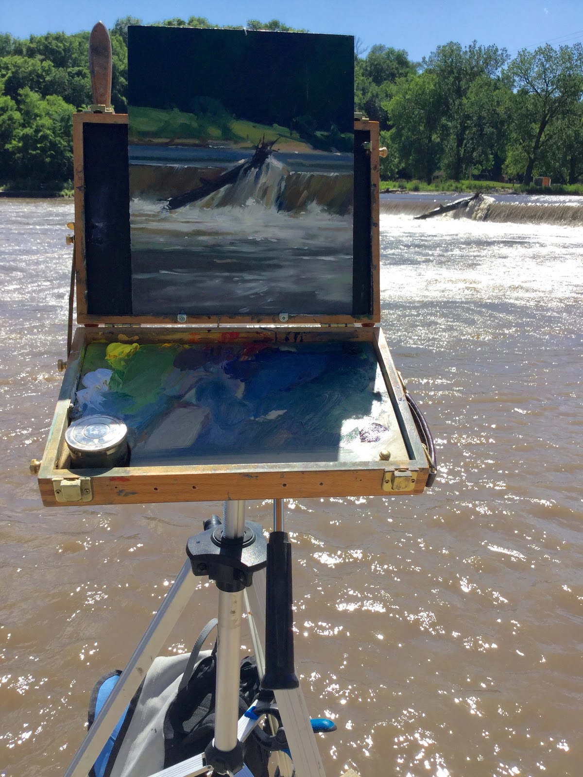
Monday, July 3, 2017

Hobbits and habits

This summer I'm trying to create stronger images by simplifying them. You'd think simplification would be simple...less work...fewer marks...less time. HAH! It's amazing how parts of you will resist the rest of you doing something good for you. Guess that's what makes the rehab industry tick.
 I decided to start with watercolor and try the quartered sheet approach I've seen artist friends benefit from. The idea is, 4 smaller images give you more practice than one large one. It's should force you to create big interesting shapes (like a Notan) because now your regular brush is effectively that BIGGER brush you SHOULD be swinging.
 Theoretically, you should use fewer strokes. Plus, a smaller image provides less fiddle-and-fuss room. Unfortunately, that bad habit works on you like the One Ring in Frodo's pocket.
 FEWER STROKES means MORE DECISIONS about those strokes - and that involves more time and mental effort. As in MORE TIME LOOKING AT THOSE BIG RELATIONSHIPS instead of constantly looking back and forth, spotting little bits of detail here and there and overworking things.
 On the first sheet I drew in the panels and painted over my drawing as usual (Sorry for the arbitrary rotating of the images. Also these are un-spectacular phone pix).

On the second sheet I forced myself to look longer - and hopefully more broadly - by just painting with no preliminary drawing. It didn't help. My problem isn't judging values or color, it's fussing with edges.
 
The part that was like Frodo slipping on the ring was this: if the initial stroke wasn't satisfying, it was too easy to get in there before the area was dry and try a second or third solution.
 Often that works...but it's never as fresh or wow! as a single hit. Do it routinely and it becomes a dubious method.  I've decided to call it "Smeagling", to remind me not to become a Gollum overstroking his "Precious".

Monday, June 5, 2017

NoTan and Bad Proportions

While that sounds like the title for a Jim Gaffigan comedy special, the subject here is getting the most from those all important thumbnail sketches that usually make or break a painting.
 First, is a Notan the same as a thumbnail? Not really. Notan is strictly B&W and shows you if you have  a big, eye catching silhouette formed by your darks and lights (or not). They're often beautiful as is. Perfect if you're outside facing a backlit subject. Less perfect with strong cross lighting and cast shadows. But almost useless if it's overcast, or the sun is behind you early or late in the day.
 Desperate situations like that are a job for Captain Thumbnail and his Valiant Values. Thumbnails add the very necessary info about all those middle values - and this is important - whether they have an affinity for the dark side or the light side. Once a few of them sneak into a value area where they don't belong, mayhem ensues.
 Just remember the lightest part of a dark area can't be lighter than the darkest part of a light area. (I know I'll get challenged on that. We can settle it with colored frisbees at dawn...but that's a post of its own).
 Bad proportions...Confucius might say "Notan no good if proportion off".  Jessica Kirby puts it better than Confucius in her post here http://jakpaints.blogspot.com/
 It got me to thinking of easy ways to ensure a Notan or thumbnail matches the dimensions of whatever you're painting on. Obviously, a sketchbook of the appropriate proportions lets you  dive in without a thought, and I'm making my next sketchbooks that way. Fear not. You won't need a small library of sketchbooks. Just 2 at most...actually one with simple modifications. 
 Most common canvas sizes are just one of two basic ratios: 3:4 or 4:5.
The 4:5 ratio corresponds to 8x10, 16x20 and also 11x14 if you crop a WEE bit off the long dimension (or even ignore it, the difference is so negligible a decimal).
The 3:4 ratio corresponds to 9x12, 12x16 and 18x24 (again, if you crop a wee bit off the short dimension It will cover 5x7 but with most sketchbooks your Notan or thumbnail will be bigger than your work!)
 BUT...what if you don't WANT to make your own sketchbooks, or just want to carry one sketchbook? Well, there's probably already an app that does all this on a phone for the laziest of you out there but don't expect me to look it up and insert a link.
 For the more ambitious, do this:
1. Grab your existing sketchbook and measure the SHORT DIMENSION (this may go easier if you use a metric ruler - most rulers have both nowadays).
2. Multiply that by 1.33 (convert to inches if your not using the metric ruler). Find that point along the LONG DIMENSION of the page and place a piece of tape at that point on the cover. If that measurement is too long, multiply your long dimension by .75 and place the tape on the cover's short dimension instead.
3. Mark the tape 3:4 and draw a line across the page there when you're making  a sketch for 9x12, 12x16 or 18x24.
4. Do the same thing again, only multiply the SHORT DIMENSION by 1.25 or the LONG DIMENSION by .8
Mark that piece of tape 4:5 and use it to make sketches for 8x10, 11x14 or 16x20.
5. Remember to put tape guides on BOTH covers (pages turn both ways) and it may be necessary to have the 3:4 guide and the 4:5 guide taped to opposite edges of the cover. PIX BELOW:


Monday, May 1, 2017

A nice gesture

Long time no blog. Now that I can import pictures from an android phone I can post again. I apologize because their quality isn't as nice as my iPad can do but there it is...
 The other night the Russian National Ballet performed Swan Lake at the Fairfield Arts and Convention Center. My my wife has seen live ballet many times. This was my first experience. Of course cameras and phones weren't allowed but a sketchbook, pen and book light were just fine. 

 Thought I would get my "Degas" on and...Wow! I have more respect than ever for the guy. 
The performance was moving on more than one level: The poses are wonderful but they last a moment and rarely repeat (Jessica Kirby makes the point he drew at a ballet studio, where moves and poses are repeated in practice. Still, I'm impressed with old Edgar).
 So...the most I could do was a series of gesture drawings, but it taught me a few things. Like there's no hope in looking at the dancer's contours. I had to unfocus slightly and burn a whole shape into memory, then put that down. 
 Sketching their gestures isn't the same as drawing everyday motions - like people walking or working.The energy seemed to be in assuming a pose then translating it into another, then another and so on. So what I was getting, really, were the momentary culminations. Trying anyway...a few pages are below. I want to attempt other things like this. Maybe ball games? 

Wednesday, August 10, 2016

Paint the Point day 1

Here is this mornings pix. The organizers for this event give us a GENEROUS footprint and the surrounding country is nice. I chose this early when the light was a bit more hazy and chased the light a bit...shouldn't do that but today it went somewhere good. That doesn't always happen. 11x14 oil on panel.
OR MAYBE NOT...apparently Picasa has eliminated the the feature that lets you upload new photos...WTFondue?

Lots of heavy hitters from MN, WI and Chicago here so the challenge is a good one. Hoping to get in another before tonight's Nocturne event.

Tuesday, July 5, 2016

Dubuque workshop

This past weekend I had the privilege of leading a plein air workshop at some of Dubuque's most scenic locations. Here's Barb Grimmer in a shady lane at Eage Point Park

The weather was delightfully cool - yes, those are folks wearing jackets on July 1...!

 The gist of what I wanted to teach was how to see on location. The sole trick to plein air is never look at anything in isolation - always compare it to something else to see where it is, how big it is, how dark or light, how dull or bright it is...and so on. Think about it: So many artists can copy a photo reference in the studio quite well but outdoors they crash and burn. Why? Because they COMPARE their work to the reference until it matches. Outside they don't...so I'm trying to inculcate the habit of COMPARATIVE SEEING. It's not easy - I have to make myself do it with every new picture. It was new to most of the group but they did quite well. I could show several examples but I've chosen this one by Leslie Leavenworth because I had good closeups of the work and the subject.


We had a great time thanks to organizational skills of Wes Heitzman and Mississippi River Art Workshops. The only mishap was John Evans' unscheduled attempt at sidewalk art - his easel drawer let go spilling his entire pastel assortment on the pavement. The final day in the Dubuque Arboretum had us dodging not one but two weddings! Here's the group (minus 5 who had to leave a bit early) just before a wedding photo shoot sent us packing.

Sunday, June 19, 2016

Time for a new palette?

Here's an oddity...

No, it's not a diptych. The image on the left was painted in August of 2014 at Oakland Mills. Jessica Kirby shot this photo of me doing it:
 The image on the right is from this May. The objects nearly line up but then they should; They were only painted about 25 feet apart. It's the nearly identical colors that makes me wonder if I'm in a palette rut?
 Granted the weather was similarly drizzly. This time I shot a picture of Jessica and artist Cathryn Layer sur le motif. Hey, maybe we're a movement and Oakland Mills is our La Grenouillere?

 Anyway, I've been using a standard Split Primary palette: two blues, two yellows, two reds plus black and white.

It works in virtually all situations indoors or out. I occasionally swap out one of the colors for a more seasonally appropriate hue but it's still two of each primary with black and white.
 Recently, I tried a different palette: one blue (Prussian) two yellows (Cadmium pale and medium), two reds (Alizarin and Indian red), Burnt umber instead of black and white. This backlit location image doesn't show it well.

The difference in mixes threw me at times but back in the studio the picture stuck out on my rack of plein air studies. The split primary pictures didn't just have similar hues in subjects with similar weather conditions; sunny days had nearly identical hues to overcast days and images from different seasons shared the same mixes as well. My value structure was appropriately different and the proportion of hues was different but the hues themselves were the same. That's a given problem with pastels but maybe oils and watercolors could benefit from setting the palette a bit more specific to the subject?

Monday, June 6, 2016

Reinventing the Wheel 2

Since most of this summer's blockbusters are sequels or reboots I thought I'd get in on the fun and update the last post . I'm looking forward to Ben Hur...this is the story's 4th remake. I saw the the 1959 classic on a two story high drive in screen...that's why they called them epics.

Anyway... This time I painted in the center of our "color pick" to suggest all the lower chroma hues and where they would appear.


It's not geeky science-y perfect but it's not way off either. It's mixed on the fly from the palette, just as you would in a painting. That was the point of the redo: create a color wheel that corresponds to the actual act of painting   In the second image I've superimposed two strips of mixed color to show they plot pretty true.

The vertical one is ultramarine + cadmium yellow pale. The diagonal one is ultramarine + cadmium red