
No, it's not a diptych. The image on the left was painted in August of 2014 at Oakland Mills. Jessica Kirby shot this photo of me doing it:

Granted the weather was similarly drizzly. This time I shot a picture of Jessica and artist Cathryn Layer sur le motif. Hey, maybe we're a movement and Oakland Mills is our La Grenouillere?

Anyway, I've been using a standard Split Primary palette: two blues, two yellows, two reds plus black and white.

It works in virtually all situations indoors or out. I occasionally swap out one of the colors for a more seasonally appropriate hue but it's still two of each primary with black and white.
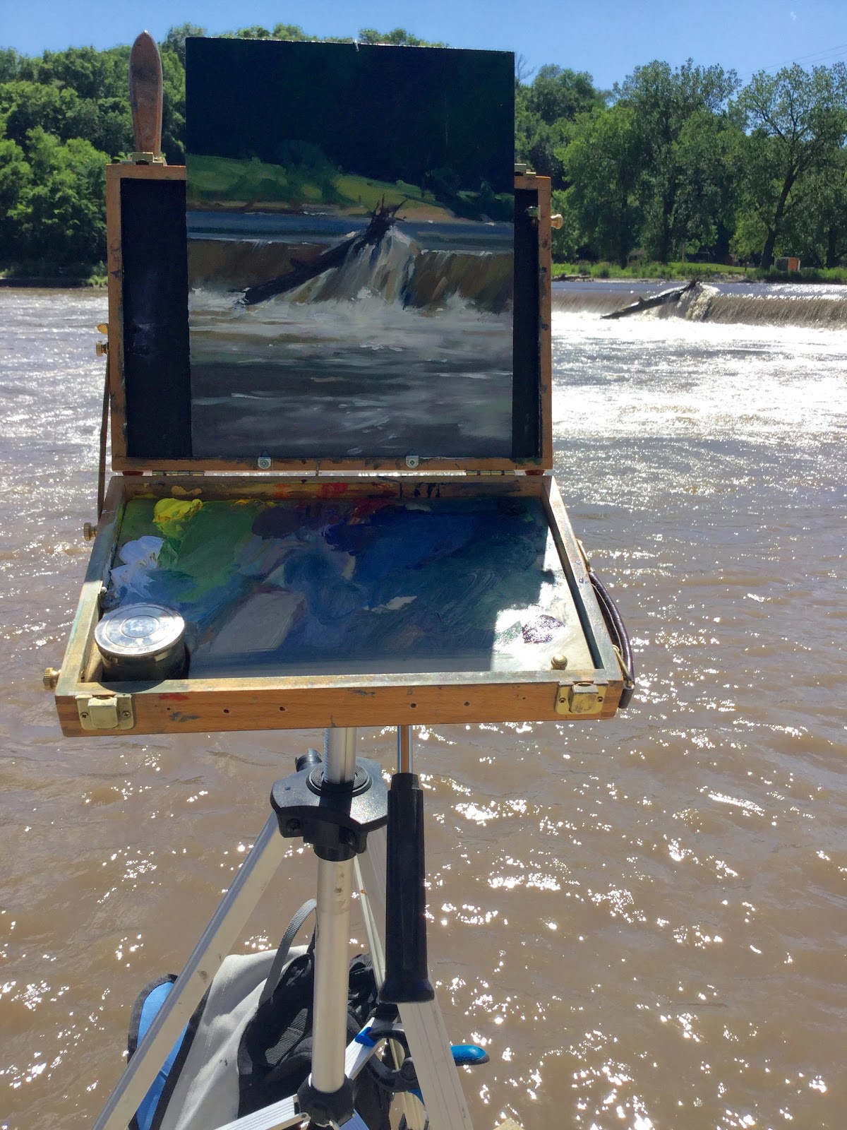
Recently, I tried a different palette: one blue (Prussian) two yellows (Cadmium pale and medium), two reds (Alizarin and Indian red), Burnt umber instead of black and white. This backlit location image doesn't show it well.
The difference in mixes threw me at times but back in the studio the picture stuck out on my rack of plein air studies. The split primary pictures didn't just have similar hues in subjects with similar weather conditions; sunny days had nearly identical hues to overcast days and images from different seasons shared the same mixes as well. My value structure was appropriately different and the proportion of hues was different but the hues themselves were the same. That's a given problem with pastels but maybe oils and watercolors could benefit from setting the palette a bit more specific to the subject?
No comments:
Post a Comment