Friday, August 28, 2015

Bandaid 3: Color block in

So here's the thing with the basic colors blocked in.


Now I can "see" it a bit more clearly. I want to create more "broken" color in some areas - meaning the value of a given area will stay the same but hue will vary a bit. That said, there will still be some value adjustment in a few areas and the basic color in some areas will need to be more specific. For example, the greens are not quite right in the trees: The shifts between the light and shadow areas isn't convincing yet.
 I can also see the bands need a bit more work...I think it might be nice to use the shallow ripples at the bottom band to create a "Z" up to the right.
Most of all, I want to experiment with thick and thin paint passages. This is something a painting can do that screens and printed imagery can't mimic successfully. The trick will be not to do it willy-nilly but in a way that communicates space or natural texture.
Tomorrow I'm off to Marceline, MO for a plein air event so I'll have a day away from this and be able to see it with new eyes.

Monday, August 24, 2015

Band aid 2 The "rough in"

Well, this is the block in so far. I wanted a sort of full size "thumbnail" as it's been a while since I've painted bigger than 11x15. That way I can see if my areas read at scale. Sometimes an area of one value looks great at 3x4" but when you blow it up to size it's too much space with nothing happening.
So far, I'm happy with the vertical and horizontal intervals. Adding color shouldn't create any unpleasant surprises...we'll see.

Not working on a toned surface as usual either. The shady bits are key in this image so I want clear, discernible colors in the darks. On a white surface a medium dark looks VERY dark so hopefully this will keep me from pitching my shadows too close to black.
Since this is inside a white canvas won't "snow blind" me.
 The rough in was done with ultramarine, cad red and white (a bit of white + ultramarine for the closest water). The sky is white canvas at the moment as I've decided it's the lightest area overall. It's going to be - I hope - an opalescent mix of the primaries. Pure whites will probably be saved for glints in the water. Right now Carlene Atwater and Carol Marine are blogging really nice horse images and it makes me wonder if a heron would be nice tucked in somewhere not immediately obvious?

Thursday, August 20, 2015

Band aids

One of the toughest composition problems is dealing with horizontal bands of stuff that make a "flag" of your picture plane. This tends to flatten the space we work so hard to suggest. Landscape painters the world over wrestle with this but Iowa has to be the equivalent of the Russian Front in this. Endless bands of corn or beans throw up a repoussoir at every turn (a barricade or fence-like obstruction to the viewer's visual passage into a picture...ooh la la) And - if I may show off a bit more here - the French word for landscape is PAYSAGE. (Auto correct tried to give me Pat Sajack there...sack ray blue!).
If you try to paint a river, same deal...unless you stand in it and look up or down stream.
Below is a view from Ely Ford on the Des Moines river which I want to do large - 42x36. This reference photo shows what a festival of horizontals I'm faced with...
.BTW, check Jessica Kirby and Carlene Atwater's posts at right. They're wrestling with the same problem on the Mississippi, near Nauvoo (ironically, when the Mormons left there they forded the Des Moines at THIS spot).
Below is an oil pastel study which I will use for color as the greater variety (read more than green and blue) will hopefully break up the bands a bit...or at least provide SOME distraction.

I'm also going to go with the vertical orientation - it lets me "pack" the top band with more junk. ANY ASYMMETRY HELPS IN THESE SITUATIONS. Here's the drawing in charcoal: 2/3 water, 1/3 trees...and hopefully the reflections cutting into the other "bands" will interlock them a bit as well.

ANYTHING THAT OVERLAPS OR "STITCHES" ACROSS THE BANDS BREAKS THEM UP AND SUGGESTS FOREGROUND, MIDDLE GROUND, BACKGROUND.
In subsequent posts I will show the progress of this picture

Tuesday, August 18, 2015

Seeing in layers

I'm hoping to communicate the idea of seeing a subject in the way you need to paint it  - as opposed to just seeing the stuff you're looking at. SEEING THE PASSAGE OF LIGHT, NOT ISOLATED OBJECTS.
Here's a painting by Edward Seago of the harbor in Istanbul. That's Hagia Sophia on the horizon. He probably did this from Prince Phillip's yacht - he was a favorite of the royal family and Phillip was an avid leisure painter who took him on world tours.

It's an oil but it makes a good watercolor/master copy project. I am presenting it in 4 versions to show the "layers" or sequences one needs to see to paint it. (Bear in mind it's hard to do 4 identical versions - they do differ but the idea should come across).
The palette is ultramarine, yellow ochre and alizarin or its equivalent. And yeah, I smuggled in some cobalt turquoise at the end...
The first 2 will show the lighter layers, the next 2 will show subsequent applications of darker colors - standard watercolor practice.
YOU WILL NEED TO TAP OR PINCH THESE IMAGES LARGER
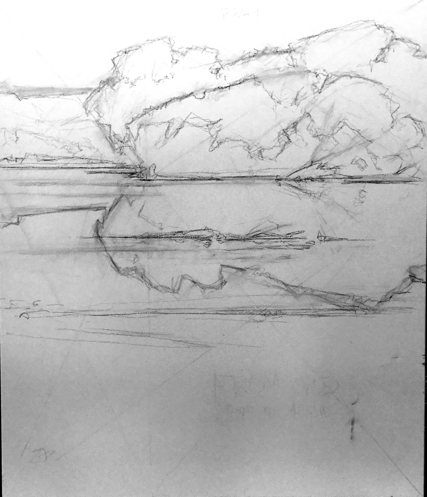
Stage one is reminiscent of this Turner Venice watercolor (2 centuries back and a bit further west)

Below, I've laid a wet wash of yellow ochre in the upper right, blue in the upper left and blue+alizarin +a smidge of yellow ochre at bottom. SLOP EACH COLOR ON QUICK AND BRING THE NEXT COLOR TO, BUT NOT THROUGH, THE OTHER. THEIR WET EDGES WILL MAKE THE CONNECTION WITHOUT CREATING AN UNWANTED 3RD HUE AT THE JUNCTION. You get a kind of tie-dye triad. LET THIS DRY. You can "mask" those light spots in the harbor and boat area with a china marker or just paint around them in subsequent stages if you're feeling deft.

In stage 2 the initial "spine" of blue-grey goes over the whole land/boat mass in one continuously painted passage so that it's still damp at the end. This way you can mop/lift some steam spots at mid-right. The color is all 3 components mixed, heavier on the blue. HINT: Put in the masts and minarets first. Then pull the horizon under them and they'll melt in seamlessly. I didn't do that on the stage 2 version but did on stages 3 an 4.
In stage 3 a darker mix of the same 3 colors picks out the closer boats and structures. Mix those colors in SLIGHTLY varied proportions to enhance the illusion of space. Paint around the lighter bits (like the striped boat hulls) or lift them later. It will do so easily since ultramarine will predominate in this mix.

Stage 4 is a darker still mix of the same colors but let alizarin and yellow ochre stand out in the mix for the closest boat. This stage gives us the "telling detail". This approach favors back-lit or foggy or low light subjects but any subject has to be seen in its layers of value. Here they're more obvious. Seeing those value layers gives a sense of the light AROUND the objects. Painting them in isolation makes them look "wooden" or flat.

Wednesday, August 12, 2015

What I learned


This last paint-out was a good education. There were some REALLY good painters there who have been to workshops with REALLY, REALLY good painters...Paint-outs are worth going to for that reason alone: you can see that knowledge applied and painters happily share what they learn at workshops.
 Here's some of what struck me as valuable:

1. A lot of the painters came from large metropolitan areas: St. Louis, Chicago, Twin Cities, Milwaukee and so on. They seemed more attuned to non-rural/architectural subjects and saw more possibilities than I did. KEEP YOUR EYES ON 24/7. Beautiful is beautiful whatever it is.

2. Consequently, they seemed to mix more interesting greys...which I don't run into as much with green, rural subjects. I need to get better at mixing neutrals with 2 colors + white to keep them clear. Actually, I sort of "blinked" or "blanked". Black + white + one color would have been more interesting than what I was mixing. 

3. Free vs. loose.
Loose implies something that SHOULD be tight is coming un-glued. 
FREE implies something intact, but has life and movement. 
I'm still a bit blocky and solid. I could lose more edges...which would just happen if I was drawing more with paint - making things vs. coloring them in.

4. Light (but not white) passages benefit from being laid in a tone darker (with say, yellow ochre or orange if it's warm) and then being painted over in white, so that the two colors mix to the desired value but have a bit of broken color interest as well. Another beautiful variation on that is a warm-hued white over a pale blue. Sorolla did that well.

5. Perhaps NOT pre-setting your palette is beneficial: Pick your blues and other colors after you've surveyed the subject. A palette limited by the SUBJECT, not arbitrarily limited. 

6. If you're putting a general tone under your shapes in the early stages, BE AWARE OF IT'S INFLUENCE. Either put down something very close to the final color or use a complimentary hue. DON'T SPLIT THE DIFFERENCE. 

7. Work out the position of EVERYTHING in the picture at the start. EVERY area has to contribute. ALL THE MORE IMPORTANT if the area is in the FOREGROUND. If it won't work change your position to the subject or try another subject.

8. Strong value contrasts stand out on the wall. If the subject doesn't warrant them, be sure to have beautiful color harmonies - they're just as good.

A lot of this stuff I know but don't always apply - especially in the heat of the moment. Another good reason to attend paint-outs!

Saturday, August 8, 2015

Day 4 Mineral Point

Well the awards party was quite a nice feed replete with wine, beer and a really good acoustic blues and roots group. With a SAW PLAYER... I love those things...sounds like a cross between a Theramin (think Star Trek theme) and a wailing female voice.

AND...I got third place! I was really thrilled because the other awards went to people who have been featured in Pastel Journal (Lisa Stauffer) and who get picked for the big invitational paint out events (Lori Berringer, Thomas Buchs).
The judges agreed with my pick and gave Nyle Gordon the nocturne prize. The artist's work is displayed in three galleries in town and the first, second and third place were all in the gallery I was assigned to. Was also pleased to see someone bought my laundromat picture and there are already bids on my third place piece...and it's only 11:45.

This morning was the quick paint and I'm amazed at how large some people can work - 16x20! Below is my little 8x10 alley scene. The light was uncooperative this morning and it was an exercise in memory work. (3:20 pm update: They gave me 1st in the quick paint and it sold as well! I found out that the judges have bought the ones that have sold so far - I'm really honored!)

The judging for those are this afternoon.
I've learned quite a bit watching some of these painters and plan to talk about it in future posts.

Friday, August 7, 2015

Day 3 at Mineral Point

Well my first attempt at night painting was fun and a learning experience. I'm not too good at picking subjects yet. A lot of the more seasoned painters chose really unique subjects - like window displays with antique toys or mannequins. I went for a laundromat interior...it looked Edward Hopper-ish to me and I tried to find as much weird color as I could in its beige interior. Couldn't recruit a down and out looking person to sit in there - that would have made it. But DUH, John, it's a town celebrating its historic buildings...what am I thinking?
Sadly I forgot to take a location snap so it's included here after being turned in. 

Here's a shot of Missouri artist Nyle Gordon at work. This would be my pick if I were judging.

This is my morning effort before turning in my two selections for judging. Of course it clouded over almost immediately so a lot of it was memory work. It started raining after I shot it.

Picking two was difficult. The majority of the work was town scenes so I put in one of those and a rural landscape to "bracket" my chances...curious if it will pay off. There's a picnic/awards announcement tonight. There's A LOT of good work at this show. It's quite intimidating. Tomorrow morning is the quick paint and they're forecasting rain so it could be interesting...all in all though the weather has been quite pleasant. And Mineral Point has many good points...could be a post in itself.

Thursday, August 6, 2015

Day 2 at Mineral Point

Another pleasant day in the 80's...today I decided to try stuff out of my usual ourvre (always use French to make things more special than they really are!)
Turned the corner and saw this lovely porch. Had a bit of trouble as the light moved diagonally across it but used a combo of shadows painted in at the start, memory and imagination. To keep it edgy and not too sweet I included the waste bin and trash bag (that's not French...that's just BS!)
After lunch at a Japanese place - really....in Wiisconson! I tried a small panel of this lovely limestone parsonage - another "off subject" for me. Getting to like buildings, I think. Now I'm going to take the afternoon easy before tanking up on caffeine for the Nocturne event tonight: 8pm-8am. Sure hope I can get some cool artist at work photos as they will be all over downtown.

Wednesday, August 5, 2015

Mineral Point Day 1

Well, it's nice to be back painting after a week of chain sawing and furniture moving (you don't want to know) but darn I feel rusty, Mineral Point is a former mining town with a heavy Welsh influence (treated myself to a pasty for lunch - they are the healthy 19th century forerunner of the hot pocket).
There's a lot to paint here and they give you a much larger footprint to choose from than other events like this. In the morning, the quaint hilly streets looked good but I opted to watch how the light changed and try it more "informed" tomorrow. So I went for something more familiar to an Iowa painter - a pair of silos. OK perhaps but I'm rusty and they aren't magical in their color.
After my pasty with Hans Olson and Jeff Allen we went to check on Solon artist Brian Parr. That's him taking a cigar break (there are 56 artists at this event scattered all over).
Then I headed east of town to try some of that rolling Wisconsin thing. Still rusty but getting back to it. Again OK but hopefully tomorrow I'll be on point. Tomorrow night is the nocturne event which will be a first for me but I've been reading Jessica and Carlene's blogs so I think I've got a couple clues. stay tuned!